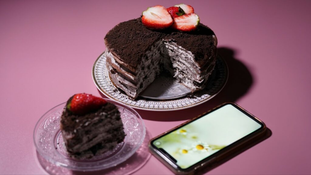
Category: Assignment #4

My responses for each question within Assignment #4 for ADV 421.

  • 3. Question 3 

    Visit the St. Clair College website. Analyze it strictly from a visual marketing strategy perspective targeting: 

    Local domestic high school students. 

    You are to provide three strategic visual enhancement recommendations. For each recommendation: 

    a) Clearly identify the issue or missed opportunity (3 x 2 = 6 Marks) 

    b) Propose a specific visual improvement (3 x 2 = 6 Marks) 

    c) Explain why it would improve recruitment effectiveness (3 x 2 = 6 Marks) 

    d) Connect it to student psychology and digital behaviour (3 x 2 = 6 Marks) 

    Do not provide vague suggestions like: 

    • “Add more pictures” 

    • “Make it more modern” 

    • “Use better graphics” 

    You need to be specific based on class content only: 

    • What type of visuals? 

    • Where? 

    • Why? 

    • What behavioural outcome would it influence? 

    Think like a digital strategist. (24 Marks Total)

    1. The very first missed opportunity which i can highlight within the website of St Clair is the lack of anything within the website content which could help to create an emotionally compelling first impression. The actual homepage of St Clair’s website is mostly relying on having a very cleanly laid out professional seeming and informative visuals however I found that these all were heavily lacking in any strong emotional intensity. In saying this, I mean that they did not have a strong immediate visual impact deposit show the imagery is successfully able to help communicate that St Clair is a structured and credible educational institution, it doesn’t do a great job at properly capturing the attention of users which as discussed and short spanned. Furthermore, this website is lacking the compelling first impression for its visitors that would fulfil the purpose of differentiating it from any other educational institution alike. On this website the visuals are functioning primarily as being representational meaning that they are just simply showcasing what exists at St Clair. These visuals are not acting persuasive in any manner as they are not helping to evoke any emotions in students. These emotional responses that this website is missing out on the opportunity to evoke here are including excitement, aspiration, belonging and curiosity. All of these emotional response potentials are significant as they could have been conveyed easily and quickly through the usage of intentional visuals through imagery which would help in the critical influencing of prospective students who are currently within the TOFU most likely within the sales funnel. Therefore this creates a  missed opportunity at the most important moment of initial user interaction for any website which is the very few first seconds that people spend on a page where they determine whether they want to stay and explore further or just simply leave the page.

    When it comes to actually working towards the strengthening of this first impression, visuals can be used through the simple creation of a high impact and visually dominant hero section. This would essentially be functioning as a highly effective means of immediately being able to gather the attention of users while also engaging them both emotionally and visually. Some specific ways that this could be achieved is first going to be through showcases dynamic camera angles and movement to replace that current static images that are not attention grabbing. Secondly, the implementation of contrast creates a sort of “break” in the user’s attention on the page to encourage their sense of curiosity to want to see what the image is rather than leaving the website immediately. The third is showcasing short form video and motion based visual content through looping very short clips and cinematic sequences throughout pages in order to act as sort of an immediate attention anchor as it will be placed near the very top of the page to be an aspect of the website visually that users see immediately after entering the website itself.

    Such a recommendation for visuals will help significantly to improve the effectiveness of the recruitment that stems from this website through the fact that incoming prospective students from local high schools are not just evaluating programs at St Clair alone but rather they are trying to actually imagine and envision what exactly their daily lives will look and feel like at the college, Therefore, by including something like a visually and emotionally engaging hero that immediately catches user attention when they enter the page, the website would be not only informational but also experiential. This is because users would now be able to see the visual hero within the first few seconds of entering the page, stop, explore and visualise themselves at the college with regard to what their lives would be like. By actually taking the time to show incoming potential students what their real moments of interaction, energy and engagement could look like, St Clair starts to become more than just an educational institution but also a lifestyle choice. Using visuals to frame this as a lifestyle choice from a digital marketing perspective is very significant as this helps to increase the level of perceived value and overall emotional connection (both key drivers in decision making) that the college has to offer students.

    It’s also important to take note of how many high school students are going to be very heavily influenced by emotions in the sense that they are often feeling their emotions before they actually think as they engage with content. This is because of the fact that this is an audience which is having their content expectations shaped by platforms like TikTok or Instagram where the content is fast paced and engaging visually which stimulates their emotions. Therefore, the more simple and mundane visuals like what St Clair currently has are much more likely to be overlooked and even ignored often. This is in contradict to the more stimulating and emotion evoking content that works to immediately capture attention and increase engagement as a result of its inclusion. Furthermore, having very emotionally engaging visuals also helps to improve the likelihood of people actually being able to remember them. This means that the local high school students are going to be much more likely to remember the college and associate it with positive feelings should this recommendation be taken into consideration and applied. This is very critical within this stage of the sales funnel for students being the top of the funnel as they are considering many different schools within a very competitive landscape as a whole.

    2. The second missed opportunity for St Clair’s website content here was within the sheer lack of visual hierarchy allowing for easy scanability throughout the website’s homepage where many users are going to land especially local high school students, This website does contain a good amount of valuable information for these potentially incoming students through the usage of organised navigation menus and internal linking. The issue here lies within pages such as the program’s display page where there are extensive lists and filters being showcased all at once in a manner that lacks clear structure. This is a negative for St Clair as this can very easily lead to users feeling overwhelmed. In addition to this, the website organisation is logical however the actual visual hierarchy is lacking in any strength with regard to guiding users attention effectively. This is because of the fact that throughout the website, the headings and links alongside the various page sections are appearing very similar in size, spacing and emphasis which is really just giving the pages all a very flat visual experience this will lead the viewers of this website to either having to actually search for what important information they need instead o benign eld directly to it if they do not choose to leave the website all together. 

    In order to make improvements to the visuals hierarchy and overall scannability for which this website is able to possess, I would recommend that St Clair allows its website to make a shift from having a text and link dominant layout to one on the other hand which is more visually based and structured. This should also help to furthermore, offer a guided experience for website visitors which includes a strong hierarchy within the hero website sedition which contains a more dominant focal point  visually within the top of the pages in order to efficiently anchor in attentions of users as soon as they enter the page. Then from here they should consider using a  card based layout for programs that showcase images, program categories/departments, programs names and a quick call to action per card. I also know that contrast within typography and scale could hel;p here as having much large headings with the calls  to action being in body would help to signal to viewers which content is of the most importance. 

    Having this change could easily help to improve the effectiveness of recruitment at ST Clair as when users are actually able to easily and quickly scan right throughout a page in order to gather a good understanding of it they are much more likely to feel inclined to stay within that website and implement it. Looking specifically at ST Clair as a recruitment focused website, this is extra critical here because these local high school students are  an audience of individuals who are often going to be actively looking into competitor institutions to compare them to each other in deciding which they feel is the best fit for them. Within the currency information heavy layout that lacks good structure , users are presented with friction as they must use more effort in order to properly navigate this website. Now, since visual hierarchy has been improved from here users can actually identify the key areas of the website easier such as programs or college news. They can also see that important calls to action for them including ones regarding applying to or exploring the programs at St Clair will become significantly more visible. Due to these reductions in  friction, there will likely be an increase in the time users spend on the website in addition to the page exploration and likelihood of conversion through applying to the institution. 

    Another important aspect of this missed opportunity is the psychology behind high school students and their digital behavior regarding college. It is well known that many current high school students are naturally going about reacting to the digital based content which they are seeing through scanning behaviours rather than full and in depth readings. This scannability is reliant on visual cites, contrast, sizing and pattern recognition quickly. They generally are using platforms like TikTok and Instagram which makes them expect a structured, quick and easily consumable continent. Therefore when it comes to websites like St Clairs, when  they significantly lack a strong visual hierarchy, what feels like mental overload can be created for students meaning the users gain friction to a degree, as they must work even hard just to simply father a solid understanding of the written content that they are viewing. This is negative as users are likely to leave the page without exploring or engaging. On the other hand, strong hierarchy helps to reduce the amount of mental effort students need to edit while considering and applying their natural patterns for scanning through contentment in order to increase their satisfaction and encourage them to engage eight hr college website as long as possible here to potentially end up converting to a student ultimately speaking. 

    3. The third missed opportunity here on St Clair’s website was the limited relativity for incoming students. Though the website itself did actually include some imagery with regard to the students at the college and the on campus life, a lot of the visuals that are on there do come across as being quite generic and intuition focused rather than focused on the customer or also known as the potential student. This is furthermore, imagery is often representative of students within a very vague and not at all specific manner. This is a negative aspect of the website content as it makes it so much harder for prospective local high school students to form a personal connection to the lifestyle being  sold to them by St Clair. This missed opportunity could be solved through the implementation of very niche and program specific visuals which are driven ultimately but being niche and envisionable for those within those programs generally speaking. For example, if a prospective student coming from a local high school to potentially join the Advertising program, if they were being consistently shown exactly what their actual St Clair college advertising program based experience would look like such as working on campaigns, learning SEO and collaborating with others to ultimately complete an internship, this creates a missed opportunity here. This missed opportunity within this area in particular with regard to relatability would exist because visuals would not be communicating that that life could be there at the college but rather just this is college.

    To help in strengthening the overall reliability here the St Clair’s website pages should be looking to prioritise their specific visual improvements such as incorporating more authentic and student centred content using visuals. This can be done through first, showing program specific visuals such as real students at the college who are actively very engaged within their program. For example, marketing students at the college who are wiring on not only their classes but unique competition experiences such as the NHL Innovation competition. This could also be showcasing more candid and less posed or overly curated imagery. This imagery would be including very natural marketing student moments such as collaborating and celebrating wins as a class/group. Another recommendation here would be using student point of view style content that feels very authentic to feature. This is because this content in  particular would  be very relatable and show what students’ real lives look like to act like as social proof for the college. This could be successfully fulfilled through the usage of diverse and realistic representation from many students and featuring it on the website for the potentially incoming students.

    Such a recommendation being implemented here with regard to the recruitment effectiveness would be successful due to the fact that these incoming students can use such relatable content in order to visualise themselves within a very specific program or environment at the college. This is impactful with regard to helping the college as it is reducing potential students levels of uncertainty while on the other hand increasing the confidence levels in not only the college itself but also the programs for which it offers.Instead of students just having to imagine what it will be like to experience a program, they can actually see what it is like through relatable visual content that is going to help them understand why St Clair is the best choice for them when it comes to their post secondary education school options. This is helping significantly to strengthen the emotional connection that potentially incoming students have towards the school as they can see people joyful and filled with ambition should these visual be added to the St Clair website.Thesse videos will also deliver potential students a perceived sense of belonging within the college which is beneficial as it makes them more likely to choose to attend the college for which they feel they would best belong in the environment of. Overall, this sense of visuals acting as relatable social proof based content is going to help increase the chances that students will either stay on the website and keep exploring and even take action to apply or visit one of the St Clair campuses.

    When it comes to truly thinking like someone within a digital marketing space, it’s important to also consider how this recommendation is recognizing that students are in fact heavily influenced by the availability of social, proof and reliability. As opposed to using generic seeming or staged imagery, these students are much more likely to both trust and engage with the visual content presented to them if it actually feels rather authentic and is reflecting the real experience of college students who are at St Clair. On a psychological level  most students when they are scrolling through the content on the St Clair website, they are asking themselves if they can actually imagine themselves attending this school. If the answer to this question is just no, they are much less likely to be engaged and interested within what is happening on the website with regard to information and messaging communicated through visuals. Many of these students are also just to some degree accustomed ti user generated continent t that often show very trustworthy and authentic content that feels less like it come from the hands of someone in marketing or advertising. This is also what drives engagement here when it comes to making the content more niche and student focused as people will see this and feel more inclined to engage while there is also an emotional connection being built as the content might feel like where they picture themselves for the next 1-4 years of their life based on even potentially a lifelong dream when it comes to a career. Therefore, by incorporating more niche, reliable and student centred visuals the St Clair website is creating better outcomes with regard to engagement and attention capturing for recruitment purposes especially.


  • Question 2b (8 Marks) 

    Explain in detail how the image(s) strengthens the post from a digital marketing perspective. You may reference:

     • Attention economy 

    • Scroll behavior 

    • Visual hierarchy 

    • Brand perception

    • Trust building 

    • Emotional triggers 

    • Information processing 

    • Conversion influence 

    Be analytical. This is not a design reflection. This is marketing reasoning

    When it comes to how the visuals I have chosen to implement within my content, they are able to significantly help in strengthening my post from a digital marketing perspective. This has been done by aligning my visual choices with how exactly users consume, understand, process and ultimately speaking, respond, to content that is within digital environments. Instead of just relying on written c;iams alone, my post is utilising and successfully leveraging the use of a structured visual sequence which consists of several different high impact visuals. All of these visuals are fulfilling their objectives here with respect to goals in digital marketing for Ava’s Lil Bakeshoppe as they capture my viewers attentions, communicate meaning and purpose celery and quickly while influencing their perception of my brand and behaviour towards it. This is especially significant when it comes to the current economy for attention and users scrolling behaviours. The reason for this from a digital marketing perspective, is within how users can be found to scroll very quickly and rarely take the time to engage with larger blocks of text that are accompanied by no visual elements. Within my post the first two images in particular of dry muffins and hard cookies and working to immediately create a sense of contrast and disruption within the scrolling patterns of viewers. This is crucial here as it is helping to act as sort of a stopping trigger for users scrolling through my blog. This is a contrast which I did not have occur on acidnet but rather it was highly intentional as it is showcasing first some visually appealing images to create a level of curiosity and make my users within the blog post more likely to want to pause and continue through my sequence of visuals. From here my visuals are quickly shifting into richer, indulgent desserts that are offered in my bakery. This is the content that rewards the attention, increased engagement and user time spent on my content post as it showcases what the headline specified would be within my content through the usage of a visual sequence accompanied by highly relevant captions, therefore creating a synergy. 

    My post here is also using a very clear hierarchy within my visuals and the narrative flow which I am using. This is being done through the usage of a very logical progression within the order of my visual sequence. To be more specific, the sequence itself was the low quality treat image, the premium treat product, the ingredient proof image, the texture differences and the final outcome which related back to the actual purpose of this content which is to demonstrate how exactly ingredient quality was used right at Ava’s Lil Bakeshoppe can significantly impact the final results in baking. This can be seen in how my image 3 is showing a strong visual payoff through featuring soft and gooey fresh baked cookies which triggers emotions of joy and nostalgia. Such a strong visual payoff here is coming right after the first images showcasing low quality examples. The next images show what real incidents look like to serve as proof and justification for the claims being made in order to boost my bakery credibility. Images 5 and 6 are helping to dive deeper into the textural and sensory based appeals being made through my content, whole image 7 is showing the final outcome as an end to a complete story shown by my image sequence.

    These visuals are also going to be playing a very critical role within trust building for my business with respect to its content creation efforts through showcasing what is going into each bailed good product. Not only do my captions naturally state what is going into my products but my visuals also are helping to communicate this transparency and authenticity surrounding bakery ingredients through providing visual proof. This visual proof is showcasing the real ingredients like butter and chocolate that my bakery ulysses while also sharing what the results of this quality being taken into such high levels of consideration can actually look like. This also helps to improve my brand’s overall perceptions through the usage of high quality and well lit close up visuals revolving around food photography since Ava’s Lil Bakeshoope is a bakery. This can be especially seen within images 3, 5, 6 and 7 in particular as they feature luscious and nostalgic seeming baked goods that are helping to reinforce the overall positioning and desired customer perception of Ava’s Lil Bakeshoppe as a premium and quality oriented brand. The low quality images also shown are helping to position my brand as being the superior choice through the usage of contracts here which is also helping tpo shape how consumers are viewing my product’s value with regard to my premium pricing strategy. Overall, due to my understanding of the attention economy and user scroll behaviour, the considerations with respect to visual hierarchy and the improvements in brand perception through trust building and visual proof, images did in fact help to strengthen this post heavily from a digital marketing standpoint.

  • Question 2a (8 Marks) 

    Why did you choose the specific image(s)? 

    Your explanation must include: 

    a) Business relevance 

    b) Target audience alignment 

    c) Image intent 

    d) Why this visual works better than alternative visual approaches

    The reason for why I decided to choose this sequence of seven different images in regard to my bakery for this content was to intentionally display in a well designed and visual manner how exactly ingredient quality within baking will directly have significant impacts on the final baked good product created. While I did include very small short written captions that include meaningfulness and relevance to be paired with each visual, the visuals themselves were the center of attention here as the e carefully selected by me to showcase very clear and progressive differences that balking ingredients make in an operative, texture and the perceived taste that the viewers of this content can imagine from seeing these images and reading these quick captions designed to be easily and quickly scanned by users. This is an approach which is heavily aligned with my brand positioning of Ava’s Lil Bakeshoppe as a whole. This is because my bakery is very clearly benign positioned from a marketing standpoint as being a premium, high quality, ingredient and technique focused bakery where quality is not just stated through words but also proven through visuals and product quality.

    Each of the images which I selected for my content are fulfilling the purpose of supporting one of my bakeries’ clear core differentiators. This is the fact that we uniquely use real and high quality ingredients only in  combination with our technique and recipes developed over several years of baking practice. The inclusion of lower quality ingredients shown within the very first images showcasing dry muffins and hard cookies is aiming to create and display a contrast between poor quality baked goods and Ava’s Lil Bakeshoppe ones which use real butter, chocolate and other non industrialized high quality ingredients. This is a progression through my visual image sequences that is helping to visually communicate in a very well defined manner my brand value proposition. This value proposition being that having high quality ingredients combined with well developed technique will in fact lead to a very obviously superior product without only relying on written statements and claims without any visual proof. Overall, this strengthens my credibility by showing proof rather than using text to make claims in isolation.

    It is also important to recognize how my visual choices within this content are aligned very heavily with what exactly my target audience for the bakery are going to expect and how they are going to behave. This is because of the fact that my business’s target audience are highly going to be influenced by aesthetics and indulgences involving food based content that makes treating themselves (by consuming baked good products) seem worth it. This content is often consisting of close up shots of gooey and soft textures and treats that allow consumers to imagine what the product tastes like which creates an emotional trigger often of joy or nostalgia. Therefore, such content is going to be highly reflective of the types of content that my target audience has and will continue to be likely consuming with respect to their preferences for content that feels familiar, desirable and highly relevant to what they are currently interested in and interested in within the foreseeable future as a whole.

    To look at my sequence of imagery here within my content, each visual piece of content that I have actually featured in here is going to be serving a highly specific strategic purpose. This strategic purpose is significant as it is helping to sort of build up the content that featured in the last visual in order to guide all of my viewers through a clear visual narrative. This can be seen first off, in how the images 1 and 2 are aiming to clearly define and establish a positive baseline for what exactly poor quality baked good products can look like. This is showcasing dry and low quality treats which create a strong contrast and capture my users attention immediately. Within the third image, the premium alternative to the image 2 low quality cookies are introduced in a manner that positions the product as gourmet and in contrast high quality. This overall is helping to create an immediate visual payoff and help users to understand quickly what is happening within my imagery choices. In the 4th image there is some ingredient level proof being provided which is strategically placed here to back up the claims being made through my text and headline through the reinforcement of both transparency and trust. In image numbers 5 and 6b there is a strong emphasis being put directly onto texture and sensory appeals through the triggering of emotional responses such as nostalgia, indulgences and cravings. In image 7 which is the final of the sequence, I wanted to ensure that this was sort of a very final branding statement for this content, The way i did this was through showing how the combined usage of quality ingredients and technique can turn into a premium and desirable result of a cake which will trigger positive associations in consumers mind with regard to Ava’s Lil Bakeshoppe. Overall the intent behind each of these visual choices within my content is to demonstrate the cause and effect with respect to my brand’s unique selling proposition when it comes to what goes into baking directly and how it affects the outcome that is the final baked good product. 

    This approach is very beneficial here as it works much better than alternative visual approaches which I could have used instead. The reason why my visual first approach is so effective here in contrast to other approaches is essentially because of how it is so aligned well with how in 2026 users are consuming digital based media. This is because in modern times many users are likely to want to scroll right past the larger pieces of text with content while putting more of their limited attention spans onto visuals that showcase contests and emotion evoking sensory images. This all helps heavily in a content creator/advertisers ability to capture the attentions of users as quickly and effectively as possible. Having my approach using short captions with images allows for captions to be quickly read and interpreted while the visuals accompanying them are instantly understood through comparison and visual cues powered by their preconceived notions and emotional triggers in regard to what’s happening in the visual.

  • 2. Question 2 

    This is a multi-part question. Please create a visual post for your blog on a topic specific to your business and answer the questions below. You will create a visual-first blog post for your business website. This involves critical thinking. What is important to your business and visitors? This is not a written article with an image added. 

    This must be: 

    • Image-led 

    • Message-driven 

    • Minimal text 

    • Strategically intentional The image(s) must carry the meaning. 

    You may use: 

    • Photography 

    • Original graphics 

    • Screenshots • Edited visuals 

    • Multi-image carousel format 

    • Before/after comparison 

    • Visual storytelling sequence 

    • Etc. The key requirement – If the text was removed, the visual would still communicate the core message. 

    Please pay attention to what was discussed in class. Ensure that you include a link to the blog post in your answer. Do not forget that this needs to be included in your hardcopy. I am marking what you hand in with your hardcopy but also need to see the digital version on your blog. If it is not online for me to view (in addition to the hardcopy), I cannot mark this question. (4 Marks) 

    You must: 

    • Include the visual post in your hardcopy. 

    • Publish the post on your blog under a category titled “Assignment 4” 

    • Include the direct URL in your hardcopy 

    • Ensure your blog navigation is working and accessible

    7 Visuals That Show Difference Ingredient Quality Actually Makes In Baking

    NOT all treats are made equally!

    Made with low quality palm oil

    Made with high quality real butter!

    What goes into the mix matters!

    Texture doesn’t lie. You can see the difference!

    Flavor is NOT forgiving! Taste the difference!

    Real ingredients and real technique. So. Worth. It.

  • 1. Question 1 

    Visuals are not decoration. They are communication tools. Provide three strategic reasons why visuals are essential to effective web content. 

    For each reason: 

    • Clearly explain the concept 

    • Provide a real-world example (not generic statements) 

    Marks are awarded for depth, not surface-level answers. (6 Marks)

    When it comes to the creation of content online, visuals are truly not just present for the sake of decoration but rather they help to act as a tool for communication. The first strategic reason as to why this takes place is the fact that visuals are generally going to help significantly when it comes to reducing the cognitive load on consumers in addition to improving their overall understanding of the content itself. Visuals are truly a key aspect of web based content as a whole as they significantly aid in making information easier and faster for people to process and understand. Oftentimes, audiences of content online will not actually read through content in full but rather they will scan and skim it in order to quickly attempt to gather an understanding based on what they are seeing first. Seeing as how this is the case visuals can help leverage this in how theft communicates meaning and messaging immediately without actually forcing a reader to work through reading large blocks of text completely. To illustrate this, as mentioned in class “Visuals are 60,000X faster to process than text”, which only goes to further emphasise this strategic reasoning for the importance of visuals within content. Visuals are incredibly helpful in this area in how they are able to support information processing quicker for users by turning ideas which they have into something that is recognizable almost instantly or at a very fast rate. This is done through the effective usage of colours, composition, texture, symbols and visual contrast. It’s also incredibly important to take note of how important this is within content where users are expecting to provide quick answers and seamless user experiences overall. When a page just feels very overloaded with text that requires users to read through it in full as it lacks visuals, users are going to ultimately be much more likely to leave before they fully have engaged with the content itself. Therefore, in this way visuals are not simply here in order to make a page look “cooler” or better “decorated” but rather they are functioning as a strategic tool for communications through content. These communications are a means of helping users understand a product or service or just a key message with less effort, less confusion and an increased understanding of the content’s meaning/purpose overall. A really good example of this is the imagery used within my own fictional business’s content of Ava’s Lil Bakeshoppe. This is because within my blog’s content I have already begun to feature some imagery such as that of a pink decorated cake on display in a bakery setting which shows visible colour and texture. This ultimately is allowing my viewers to understand what my content is about instantly as users already understand what a cake is and how it generally looks. On the other hand, had I just written a detailed or lengthy description in isolation without the presence of this clear visual, there would have been extra friction for users looking to consume this content as they would have had to stop, read my content and imagine what the content was describing for themselves. Therefore, adding this cake imagery removes this extra step in order to communicate my product’s benefits regarding product quality more clearly, convincingly and efficiently.

    The second strategic reasoning as for why the visuals placed within content are so important is the fact that visuals stay in reader’s long term memory much better than just simply writing in isolation. When it comes to visuals themselves, they are something that plays a very critical role within the creation of content and the long term memory retention that it can offer. This is because the human brain tends to process and store imagery/visuals much better than it can just text within content alone. When a visual within content is being strategically placed alongside text based content that conveys meaning with regard to what exactly the content is about, people are much more likely to not only process the information smoothly but actually remember it. This means that within online content the visuals being featured are not just communicating in the present moments when users are reading the content but rather it is also helping to influence how early users are going to continue on to recall a brand, its products, services or core messaging later on. This long term memory retention is so significant as when users actually are abl;e to recall what exactly they saw from a brand, it is gonna increase the likelihood of them converting themselves into local longer lasting customers for the business. This can be done through returning visits, increases with brand recognition and visuals also heavily influence future purchasing decisions. Overall, within internet content which is a rapidly growing means of promotion within advertising, visuals that are placed strategically alongside meaningful content are especially important for long term memory retention as users are being exposed consistently to large amounts of digital content and so being memorable is key for success. An example of this can be seen on my bakery business’s content as having images such as if I had an image of my gourmet chocolate chip cookies which is distinctive and aligned with my brand;’s identity and aesthetic, my product is far more likely to stay within my users memory than if a description of them was written in isolation. This is because even after people elevate my blog, the users will likely remember the way in which my product looks through its texture, colours and the aesthetic of the visual itself. This can help to create an emotional trigger as when people are thinking or craving a cookie or treat they will be more likely to recall my product and consider  making their way further through the sales funnel past the TOFU/ awareness phase which they are currently in. 

    The third reason here for why visuals are so essential to have included strategically within web based content is because of how they are effective in triggering quick emotional responses among consumers. These emotional responses are significant here as they help to strengthen user’s rates of engagement and memorability from the content. While long paragraphs of text by themselves within content are requiring users to actually slow down and read them to then eventually have to interpret their meanings, visuals that are paired with concise pieces of text that are strategically designed so users can scan and understand it quickly and easier allow users to process information/messaging nearly instantly. This immediate processing of the content’s information and messaging itself is very significant as it allows users to feel emotions regarding the content and its respective visuals without actually having to fully think about it due to their preconceived understandings of what is featured throughout the image. This is very critical especially within modern times in 20226 within digital based environments as so many people possess very small attention spans which bring them to make decisions regarding products or services quicker. Cognitively it is very powerful for advertisers to be leveraging and using to their advantage as visual memory allows for users to see a visual and receive an emotional trigger/response that is tied directly to what it is that they are seeing. Emotional triggers can be in relation to feelings such as joy, nostalgia, sadness, anger and more. This overall makes the content much more impactful as it is able to boost the likelihood of people choosing to engage with the content due to their emotions and makes the content more memorable due to the long lasting nature of these emotional responses. An example of this within my business of Ava’;s Lil Bakeshoppe is a close up image of freshly baked soft and melting brownies that instantly help to trigger feelings of comfort, nostalgia and indulgence for those who are consuming my content. This emotional reaction in particular is significant due to the fact that it would be happening instantly for my product because the visual of the brownies  that I would have paired alongside a concise yet relevant and meaningful caption regarding the content’s purpose itself with respect to my target audience and objective wpi;d allow my consumers to recall both my product of brownies and how seeing this imagery within the content made them feel on an emotional level. 

    RESOURCES:

    1.  Briscoe, The Power of Visuals in  Web Content Overview (W26).pdf, Slide 13