a. Banner size.
160 X 600
b. Content presented in separate frames.
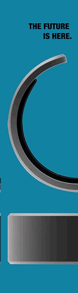
Slide one – “The Future is here”, “Take AI with you, wherever you go” photo of half left wizpr ring floating
Slide two – “Meet your new AI assistant” “The WIZPR Ring” photo of half right wizpr ring floating
Slide three – Meet your new AI assistant” photo ring with plain background
Slide four – “Be the first to try the WIZPR RING. Pre-Order now”, photo of man walking with ring on.
c. The goal of the banner.
For this second Banner our goal remains the same as our previous banner. We want to match the marketing objectives that WIZPR has laid out for this campaign.
d. Reasoning and justification for each banner as it relates to topics covered in class.
The visuals that were created for this banner match the other banners on our campaign. We also ensured that the font chosen was consistent throughout as well. This helps brand recognition and awareness by keeping advertisements creatively consistent. Similar to the first banner each frame is designed in a way that if someone were to only see one of the 4 frames they would still be able to know exactly what it is the advertisement is about. We used gain when asking people to take action by mentioning “be the first to try this product”. This can be called gain because it makes our audience feel as if they are going to be part of something exclusive if they purchase the product now.
e. In-depth explanation of your planning process and reasoning. Destination plan.
For the second banner, this banner’s goal or purpose is meant to reinforce the message that is being shown in banner one. This banner will most likely pop up after the first banner. However, if that is not the case it can still work on its own and get the messaging across. The first thing that was decided when planning for this banner was to have each frame flow together. More than how the first banner was laid out. So that’s why we decided to use the same image for the first two frames but cut them in half. This would not only match the aesthetic of our brand but it also links the slides together.
Visuals were a huge part of our banner planning process, especially in the first two banners. Because visuals mixed with copy actually increases the chance of our audience remembering the ad. If we just used body copy the memorability of the ad would greatly decrease.
Leave a Reply